Home Staging techniques rehab an undesirable condo into a highly desirable rental unit.
Nobody is going to want this condo. At least that’s what this real estate investor thinks. Why?
It’s not because of the community. It’s Heritage Hills in Somers.
It’s not because of the location. It’s in a private cluster with only 6 homes and plenty of guest parking.
It’s not because of the floor plan. It’s a 2-bedroom end unit all on one level.
What makes this home less desirable than most in this community are the five different wallpapers and original 1980s baths.
Since it’s difficult for most people to see past these things, it’s the perfect opportunity to make an offer and buy this home for a good price.
A “mini-staging,” using decorative items in the kitchen, baths, built-ins and on the fireplace mantle, helps to make this home feel welcoming and warm without the expense of rental furniture.
To augment the light staging, all areas are painted bold, yet neutral, classic colors, clean bright white is added to the trim and ceilings, and all new white outlets, light switches, and thermostats are installed throughout. It’s the details that count, especially if you are not planning to stage with furniture. The major financial investment involves the bathrooms, which are decades overdue for a major overhaul.
The total investment is just $15k in labor and materials but the Realtor feels that $20k to $30k is added to the bottom line. The unit rents within one week with multiple offers.
We hope you enjoy these room-by-room transformations.
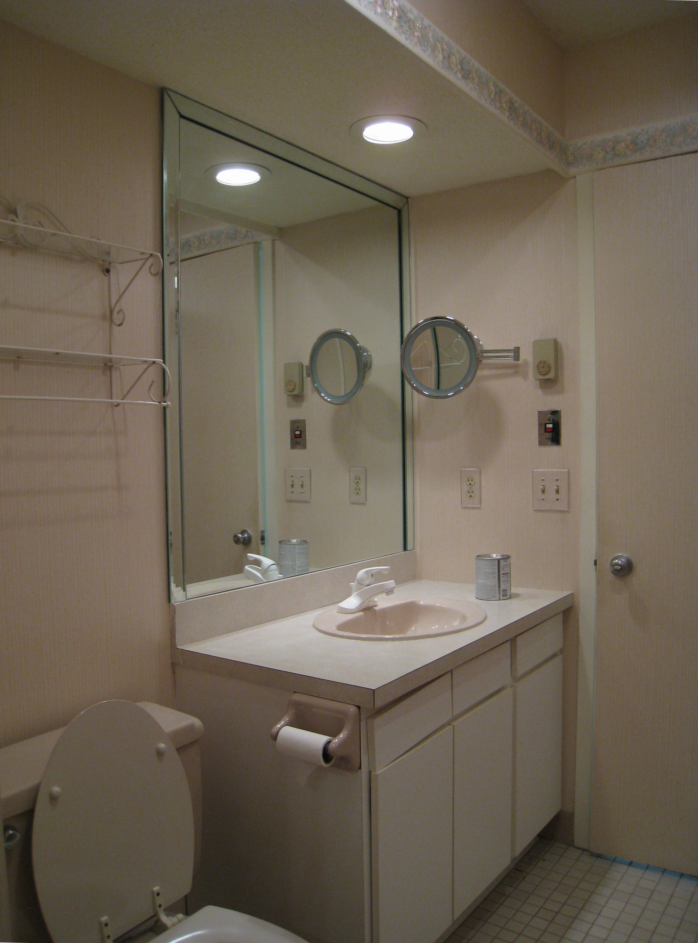
Hall Bath – Before
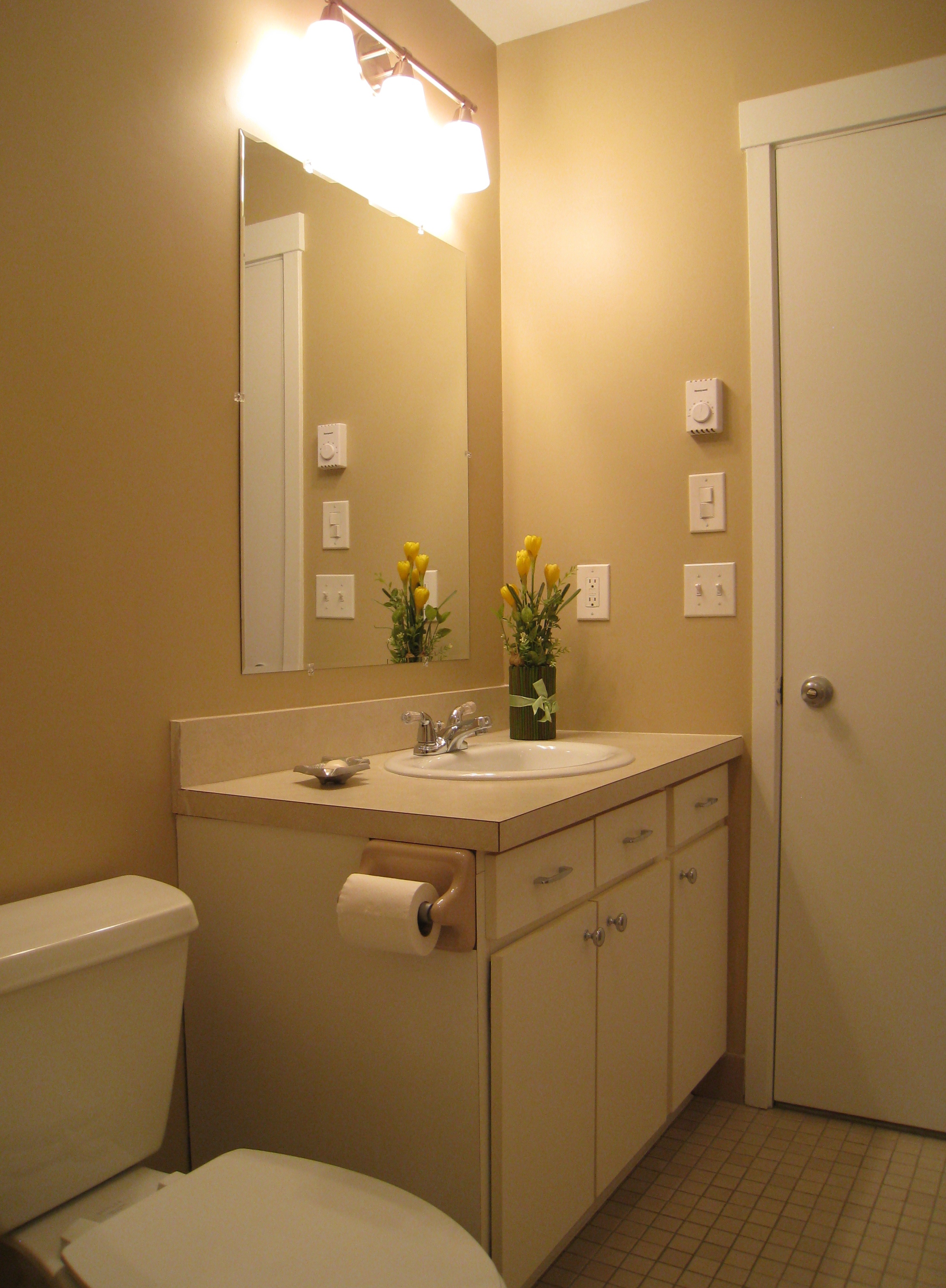
Hall Bath – After
How do you update this space at minimal expense without opening a can of worms? A series of small updates and changes including a new toilet, sink, cabinet pulls, mirror, light fixture, bold but neutral paint color, removal of the soffit and smoothing of the popcorn ceiling, are made. Eventually this bathroom will be completely made over, but for now, these changes will suffice.
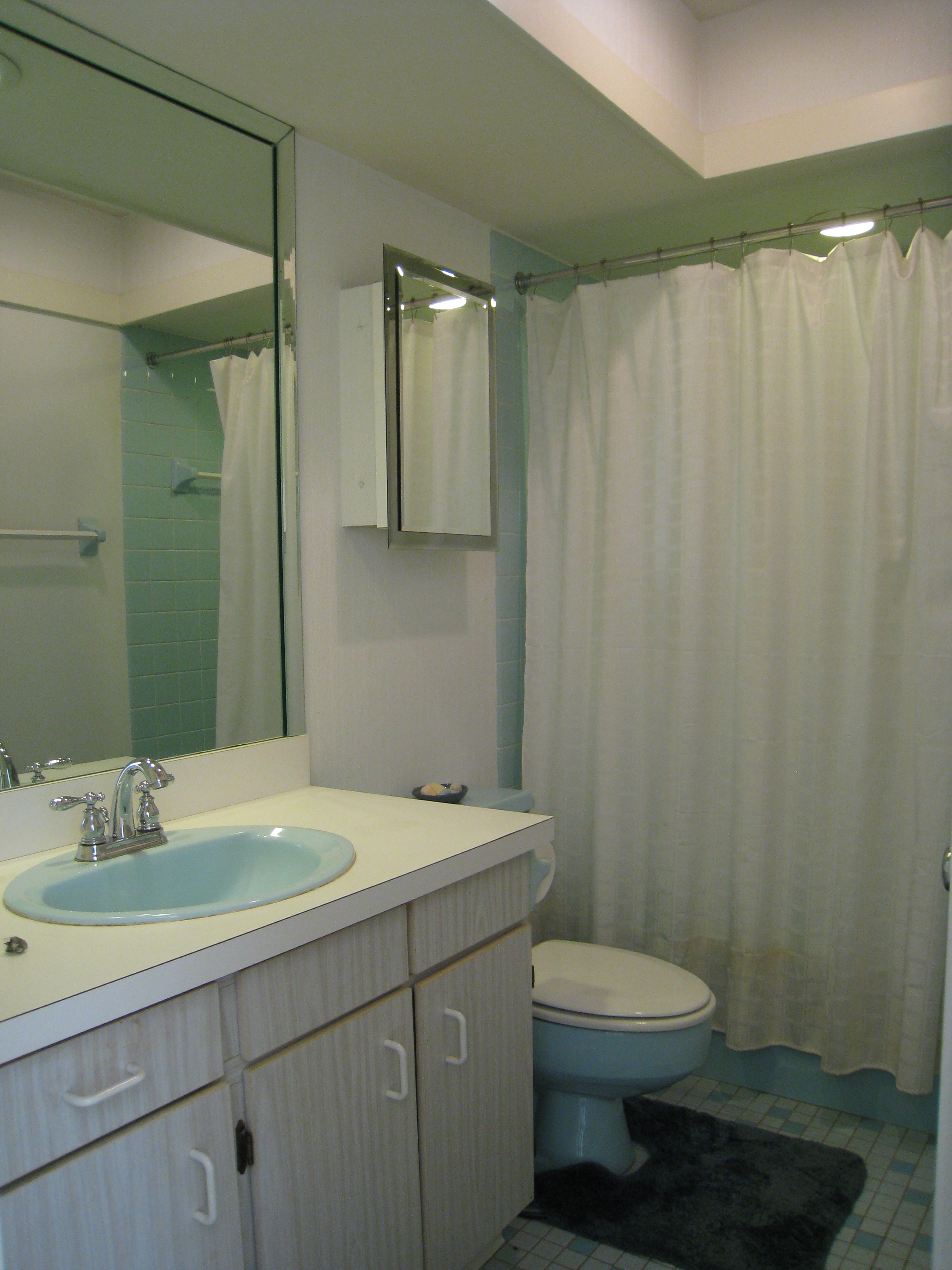
Master Bath – Before
Master Bath – After
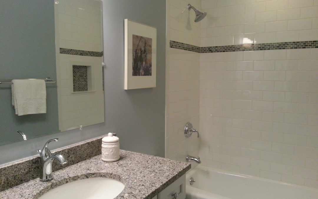
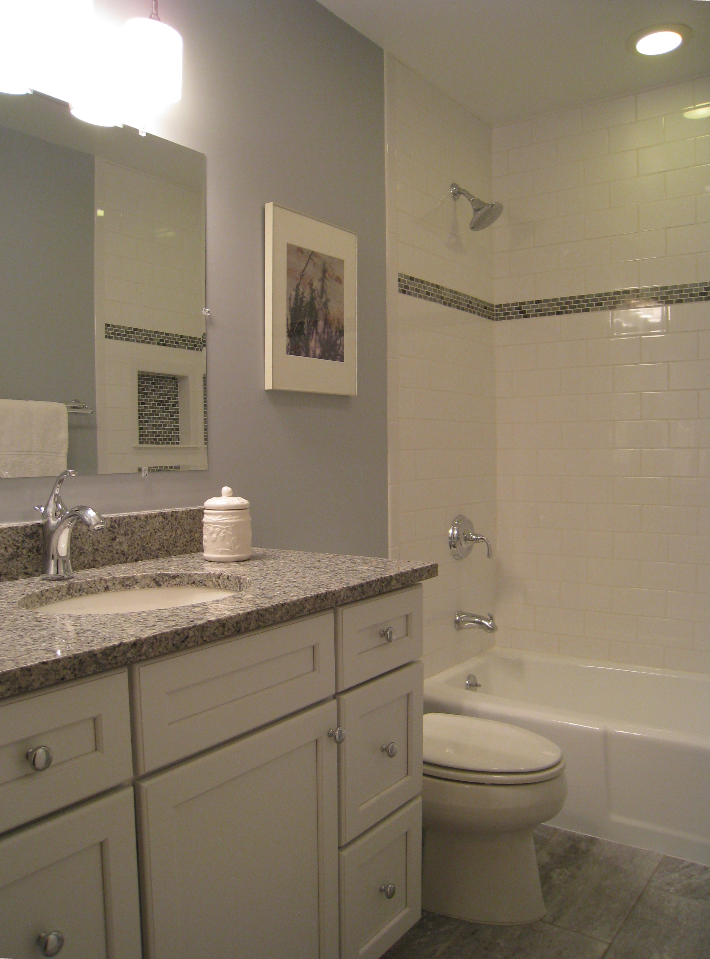
The majority of the budget is spent here with an almost total gut–including new toilet, tile floor, vanity, mirror, light fixtures, exhaust fan, soffit and wallpaper removal, and tub glazing. To get top dollar, this electric blue just has to be vanquished from this space. Classic subway tile is always appealing and one of the best values in tile.
Kitchen – Before
Kitchen – After
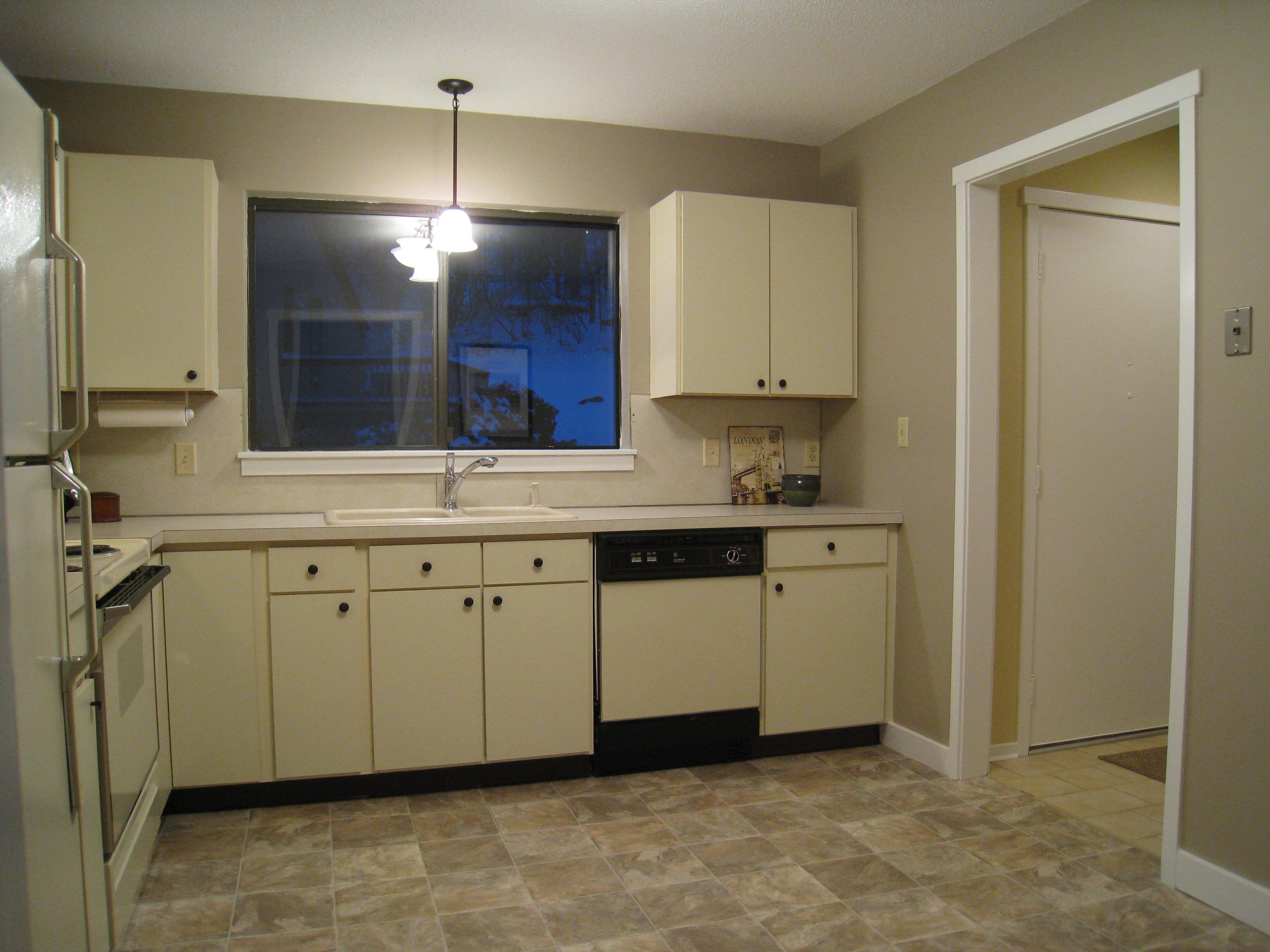
The biggest changes are new lighting, a new floor (that at first glance appears to be tile, but is just a few hundred dollars’ of durable linoleum), and replacing the wallpaper with paint. A small detail, knobs on the cabinets, adds that touch of “jewelry” the kitchen is missing.
Kitchen/Living – Before
Kitchen/Living – After
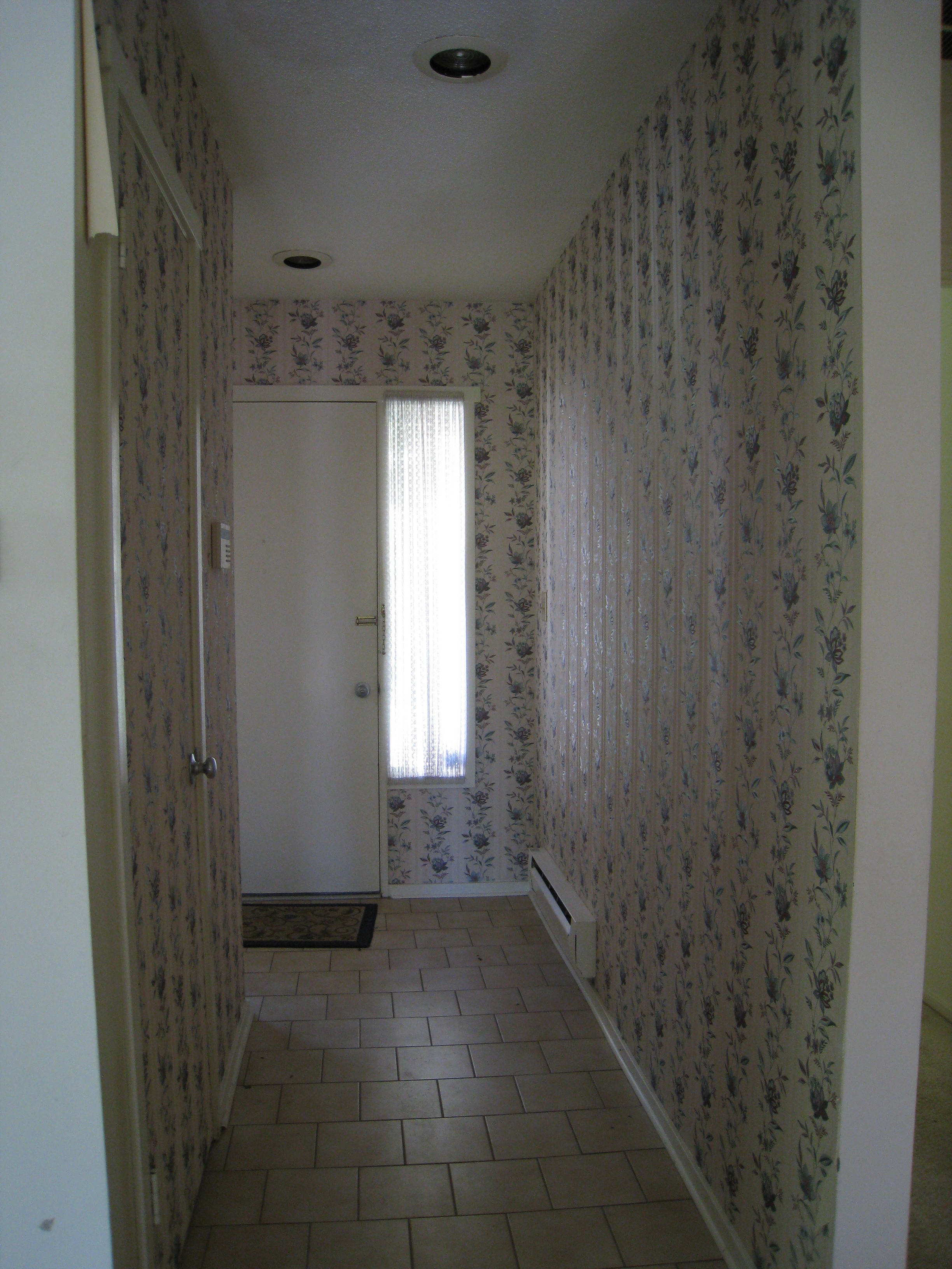
Entry – Before
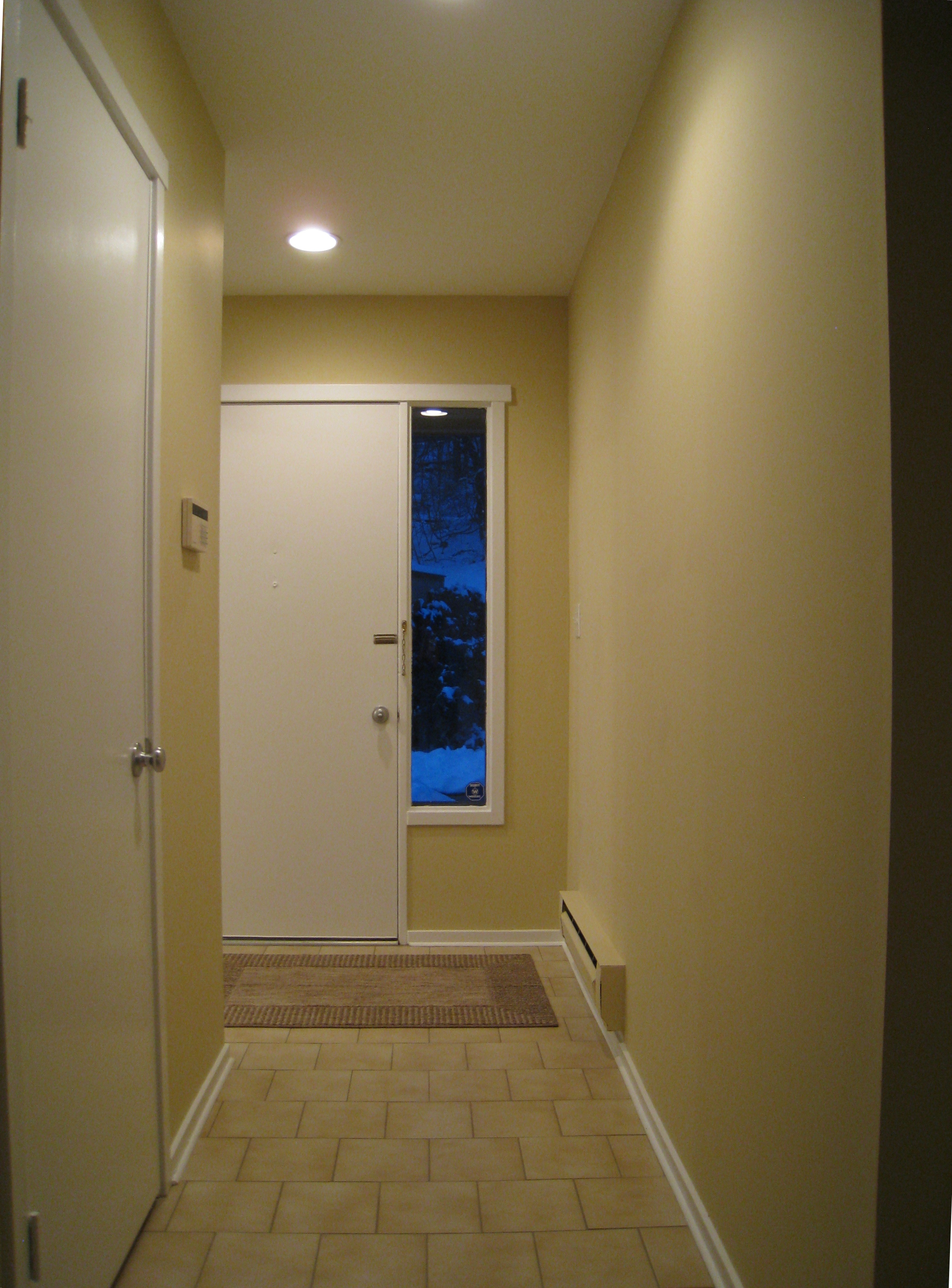
Entry – After
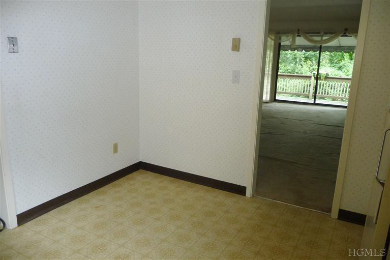
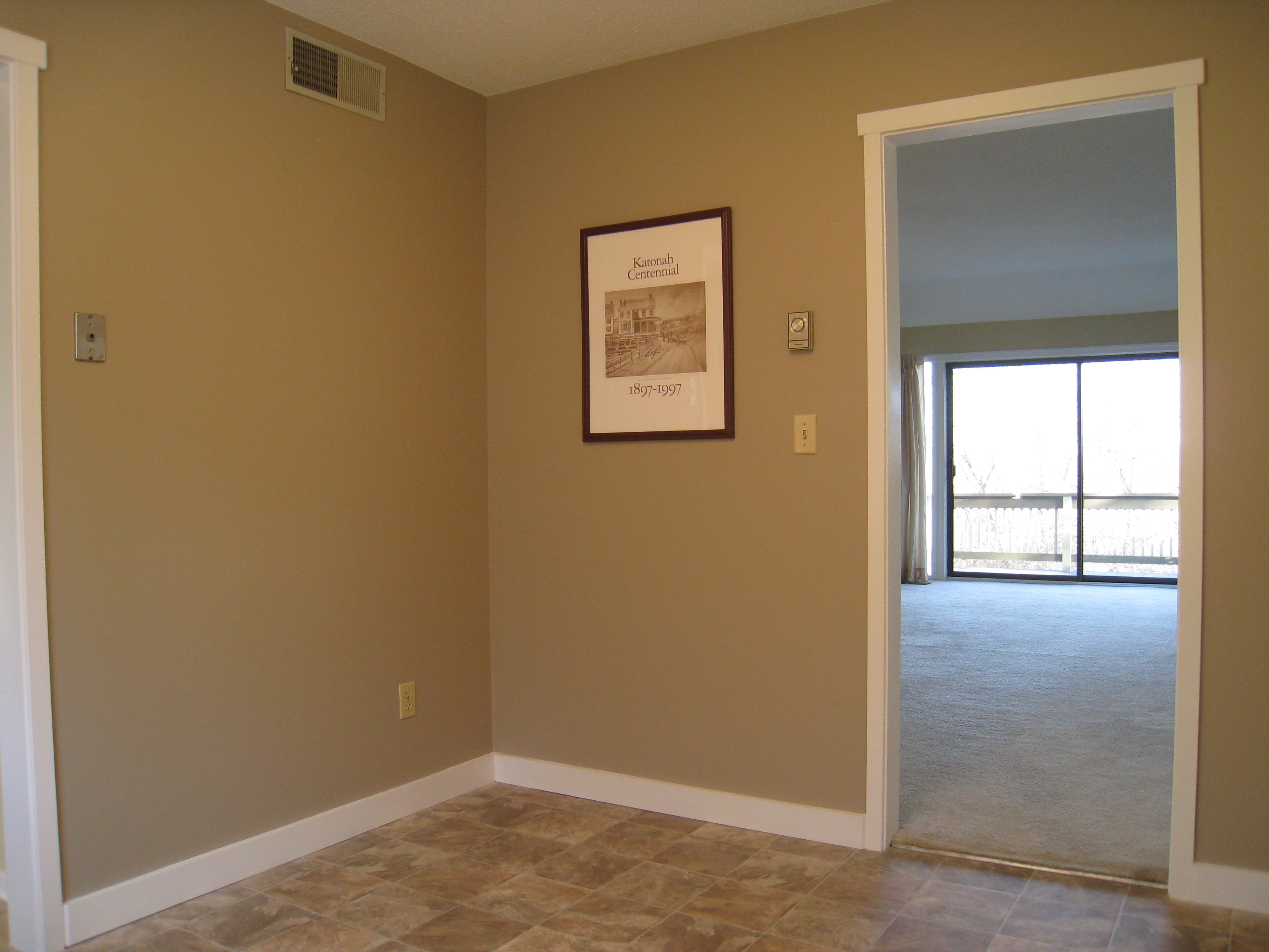
First impressions start here, and this window treatment and wallpaper have got to go! The lighting is also updated for just $5 per fixture by simply removing the glass covers, adding a new liner, and viola, brighter more modern light!
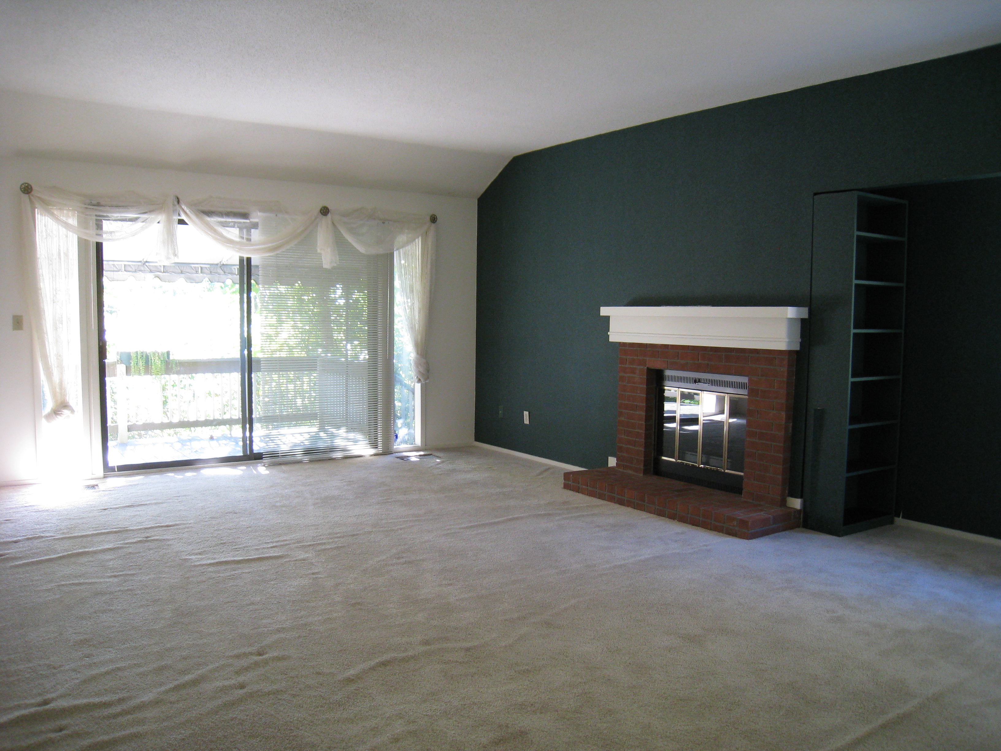
Living/Dining Area – Before
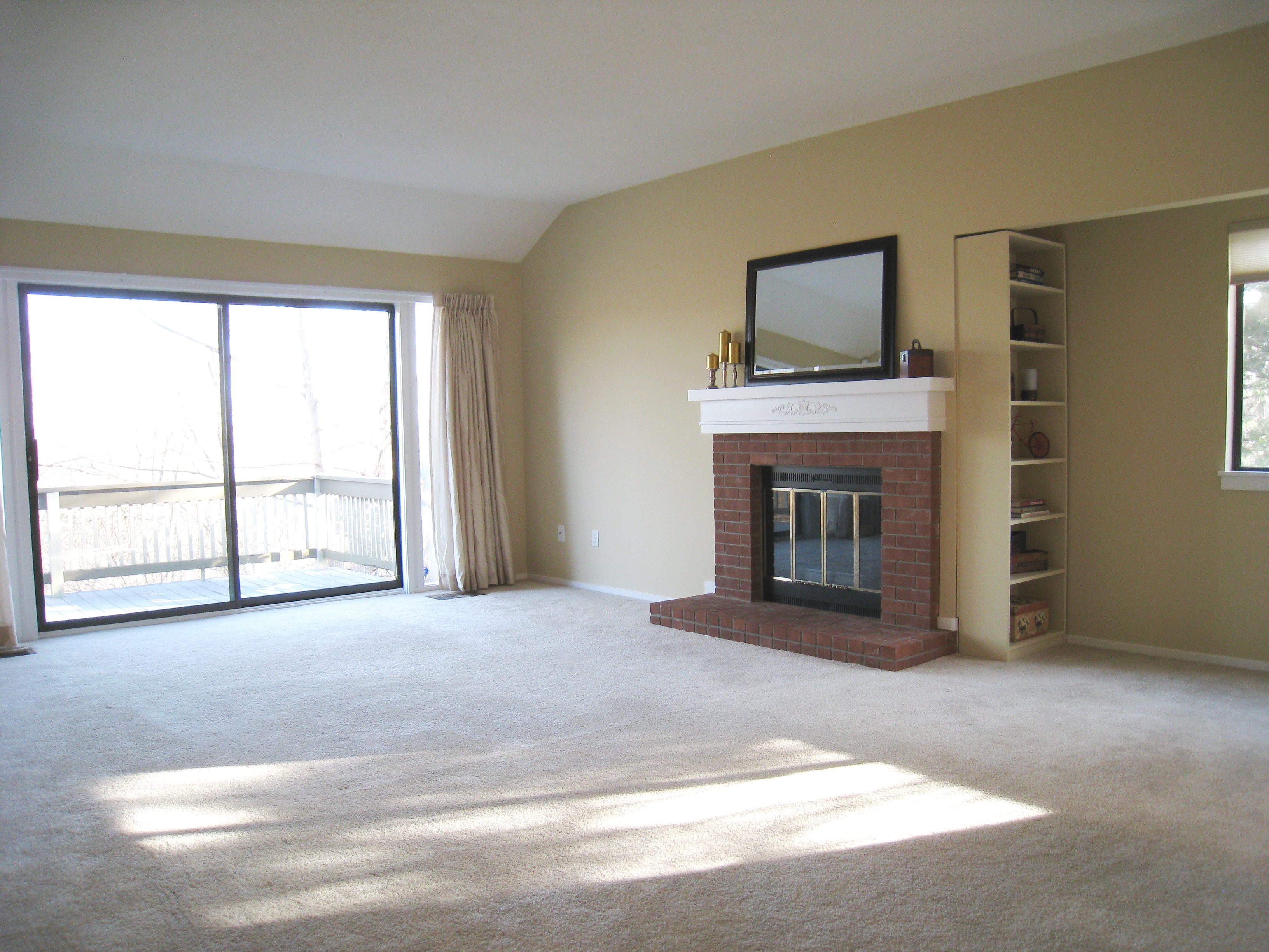
Living/Dining Area – After
Having the carpets stretched makes them feel new. Removing the big green monster of wallpaper helps to brighten and lighten this space. And insulated window treatments large enough to cover the sliding glass windows are selected for both their good looks and energy efficiency. (Yes, vertical blinds would have been ideal, but my allergy to vertical blinds would not allow for this option.)
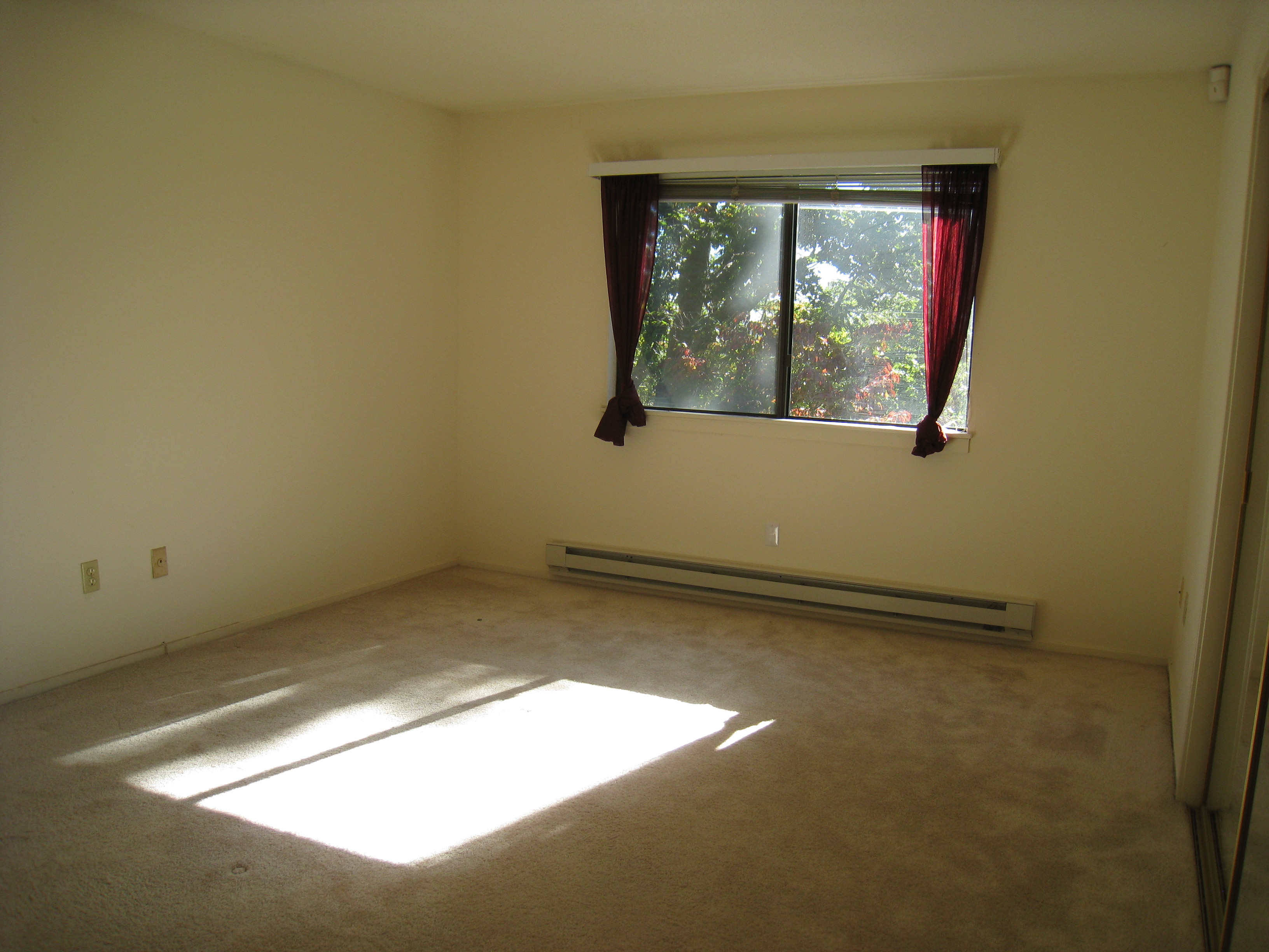
Master Bedroom – Before
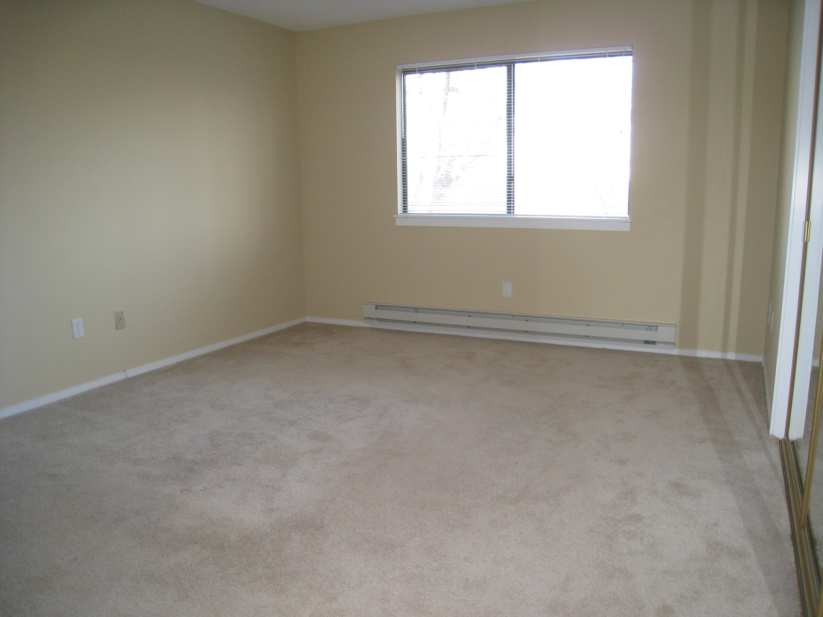
Master Bedroom – After
Not much work is required here. Removal of old window treatments with an inexpensive–but new–venetian blind and new paint finish this space.
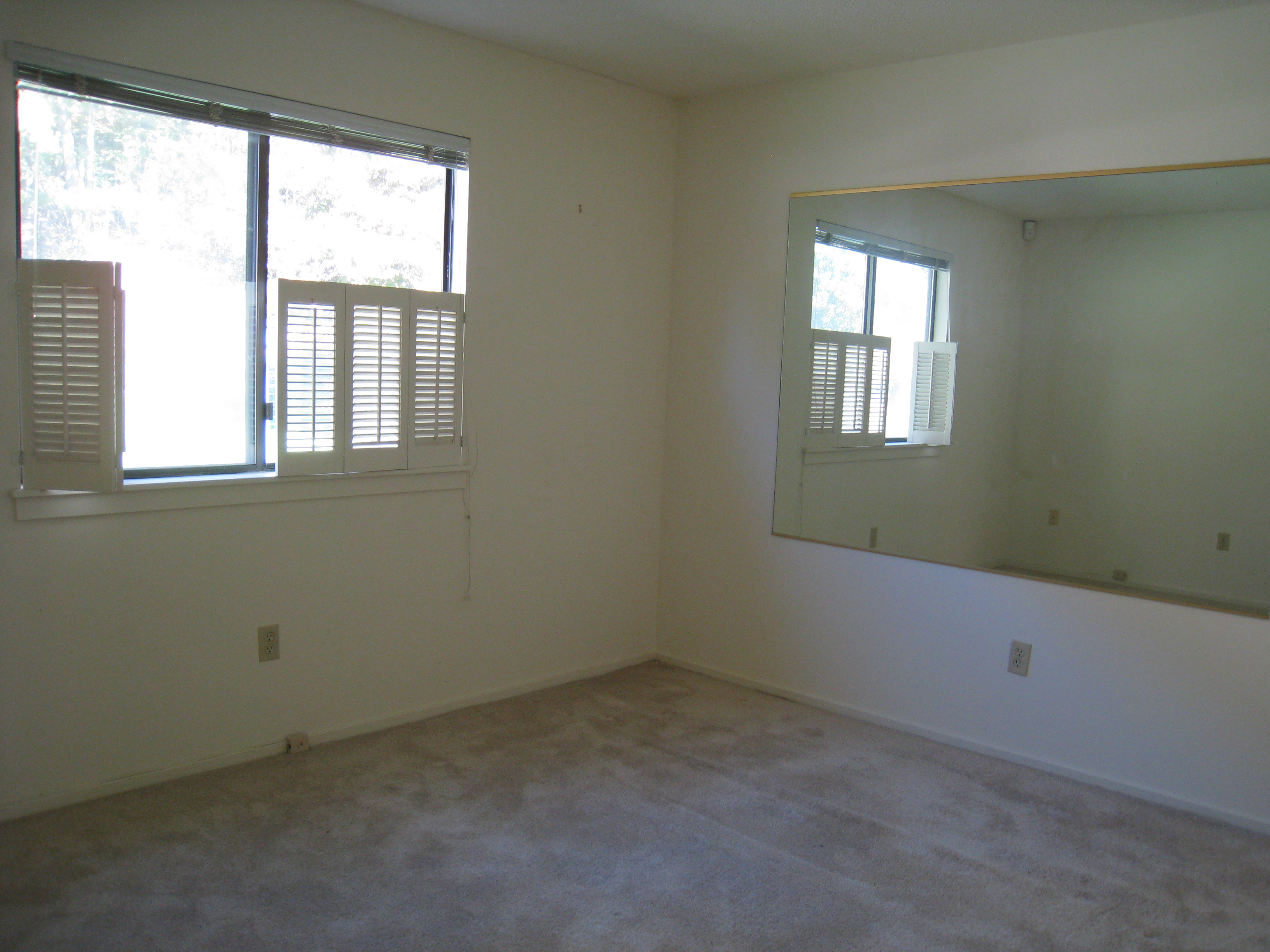
Second Bedroom – Before
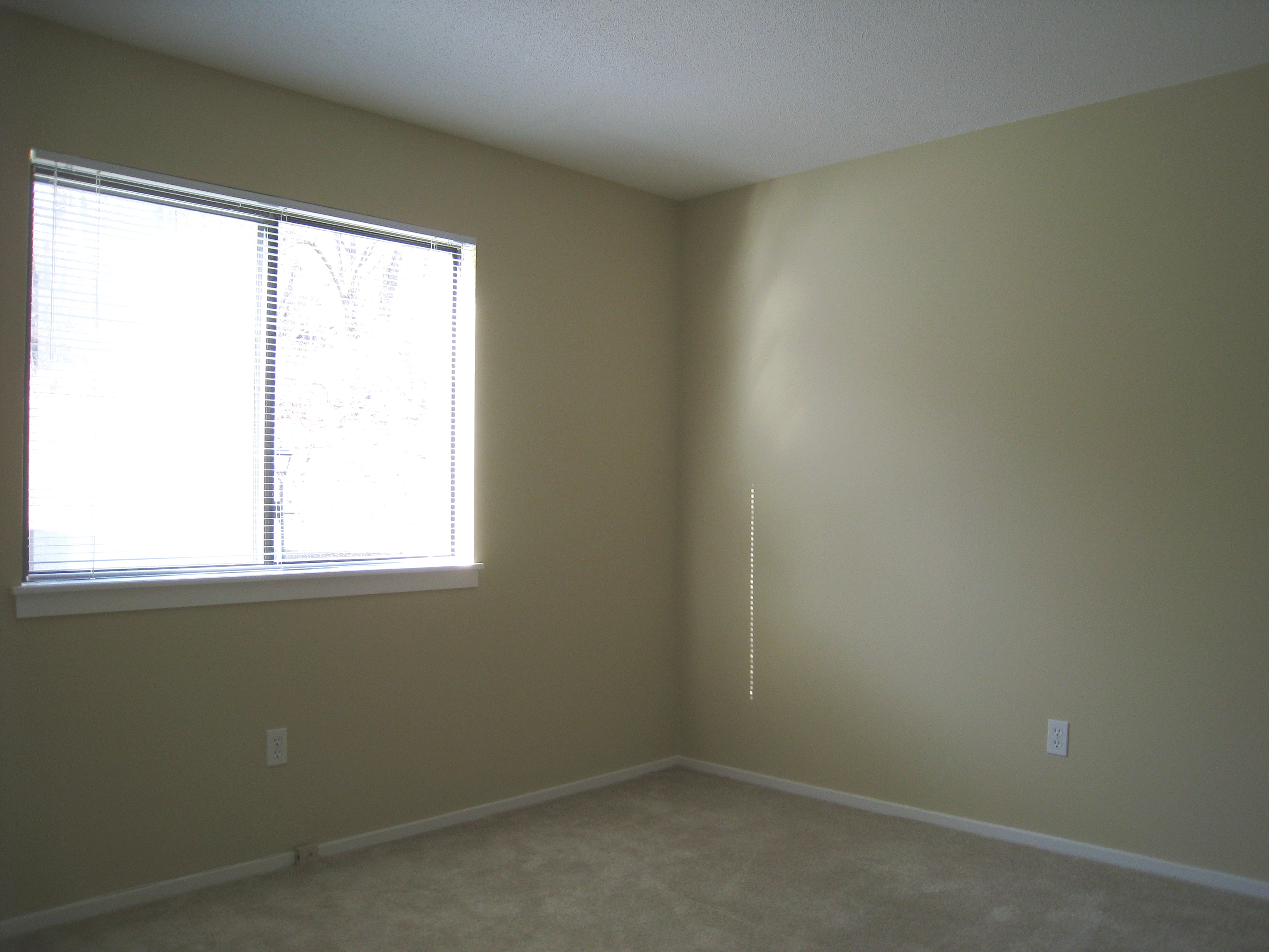
Second Bedroom – After
Similar to the master bedroom, little work is required here. Window treatments are simplified. And the mirror is removed as it’s too taste-specific and feels odd in an empty space. You never want buyers or renters thinking, Why is that there?
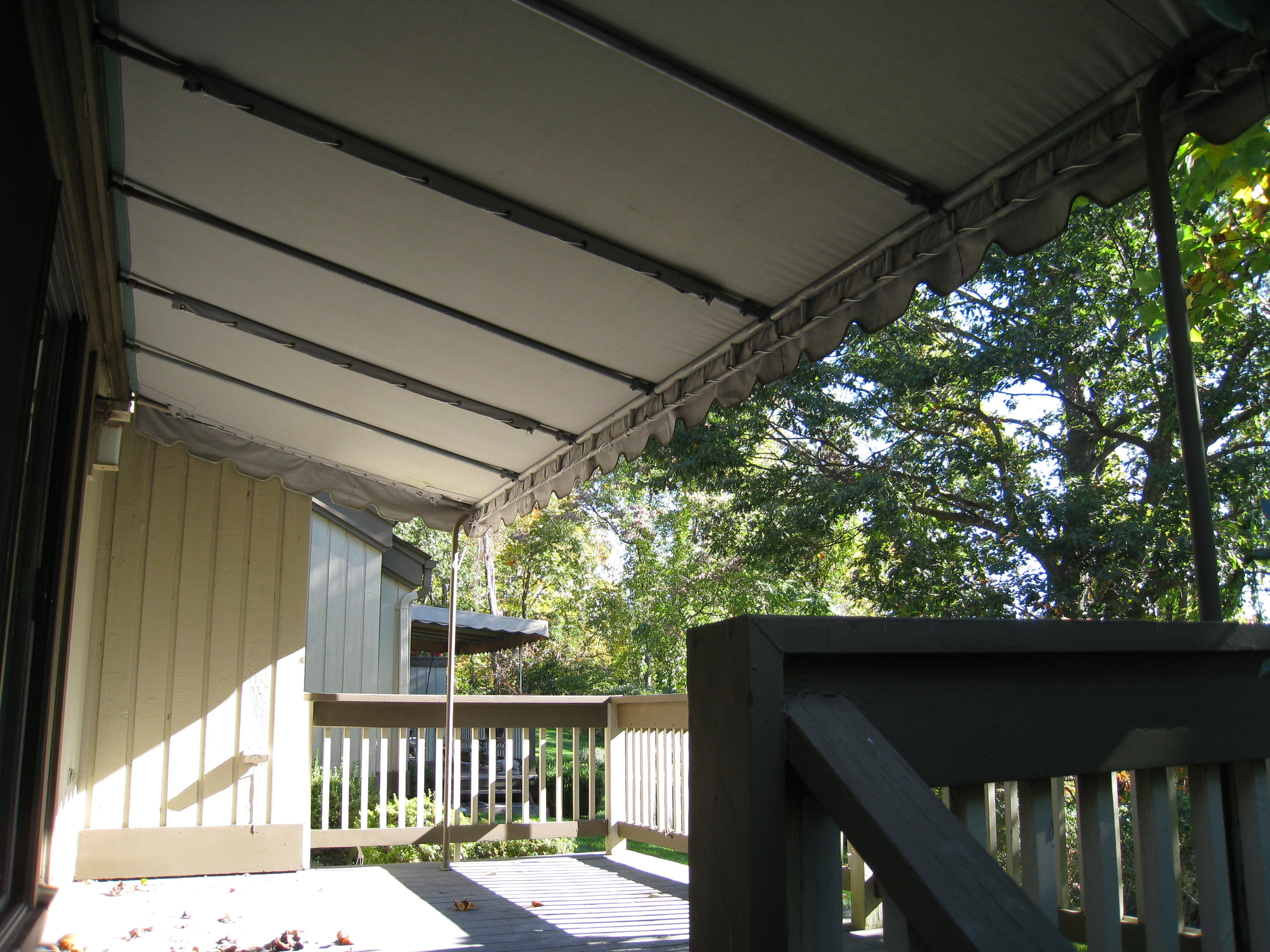
Deck – Before
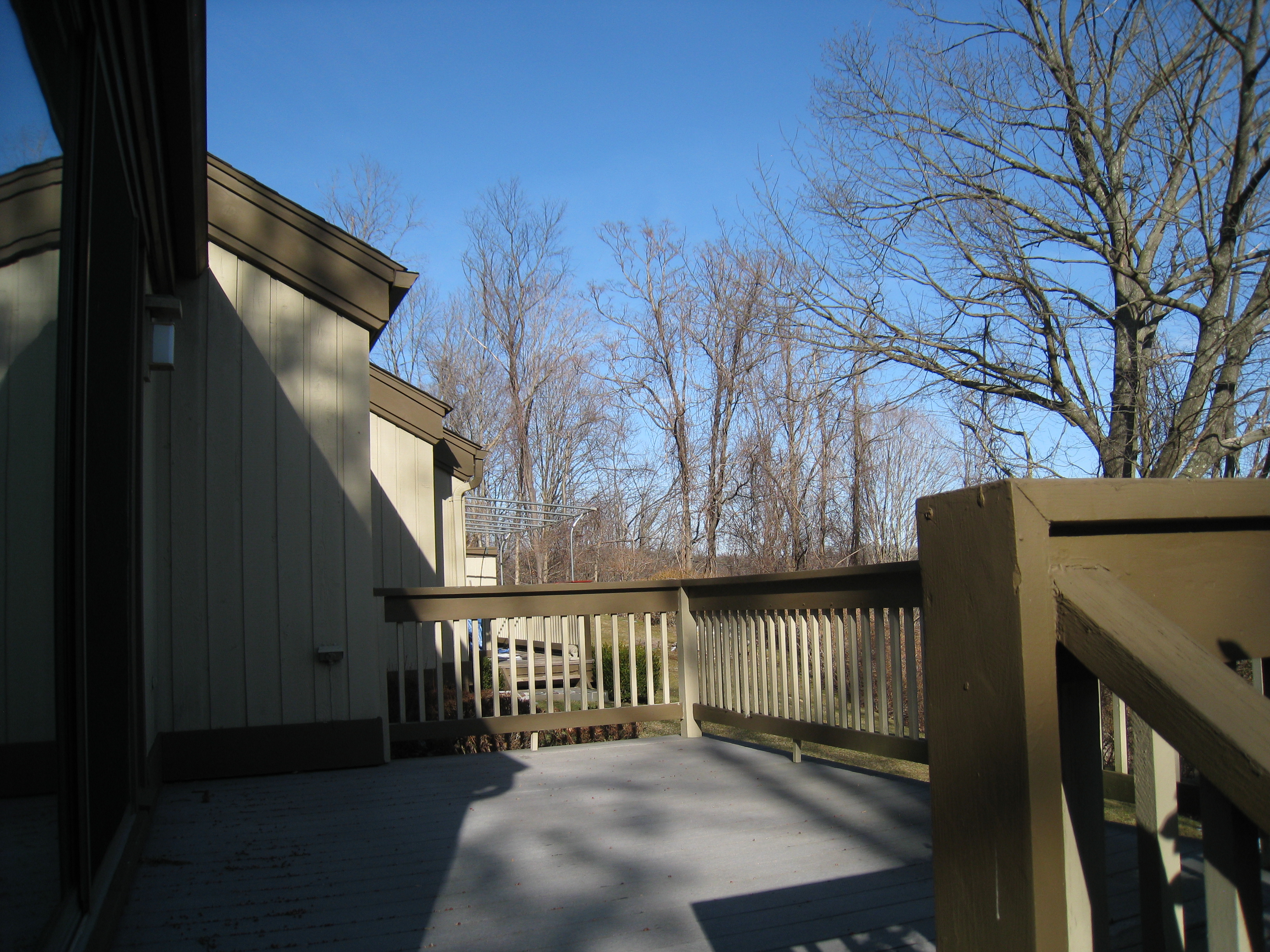
Deck – After
The best update is the simplest update. Remove the awning. The metal prison like bars look awful in the winter, and it costs too much to have the awning maintained. A retractable awning would be nice, but the expense can’t be justified for a rental unit. The added light makes this unit that much more desirable.

